Overview.
Tinkercad had enormous potential but was positioned primarily as a specialized CAD and 3D-printing tool. The acquisition experience relied heavily on explanation, while onboarding and first-use interactions created unnecessary friction before users could experience the product’s simplicity.
I led product design and growth efforts across acquisition, onboarding, product positioning, experimentation, localization, and education-focused experiences—connecting product improvements directly to measurable global growth.
BEFORE
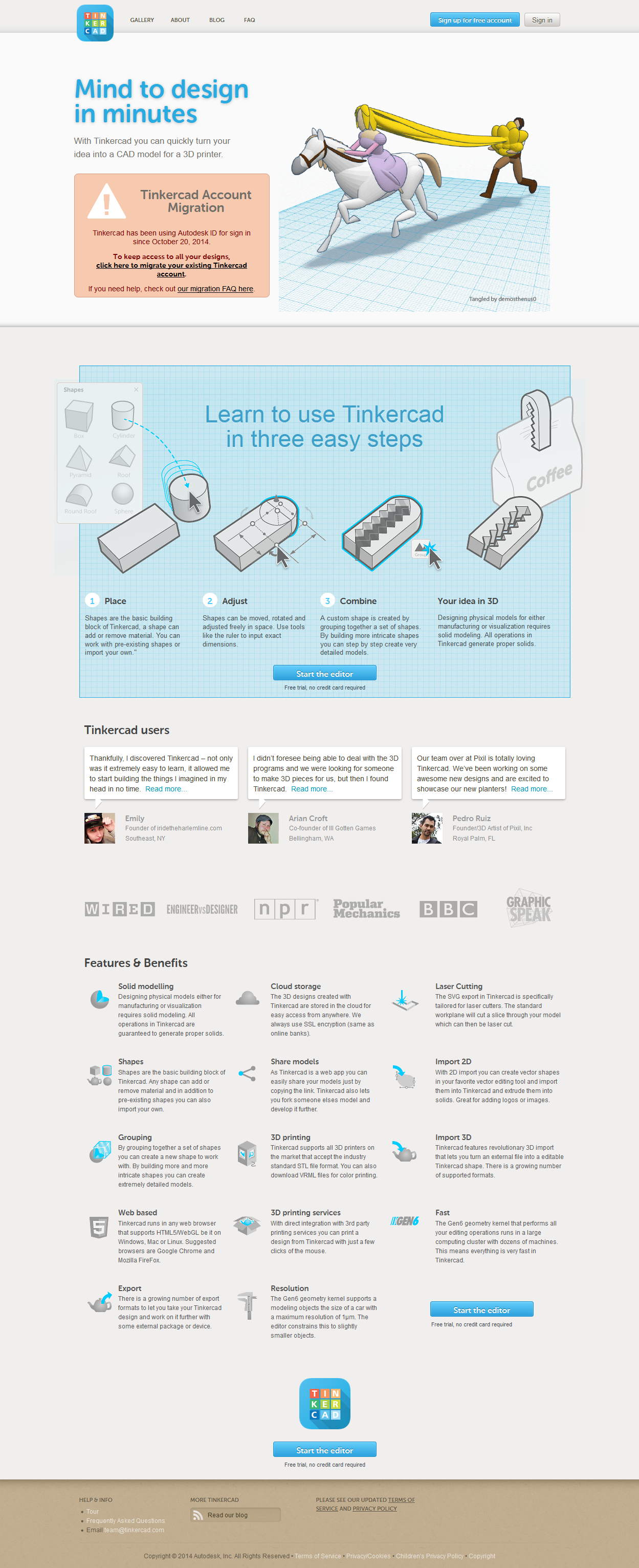
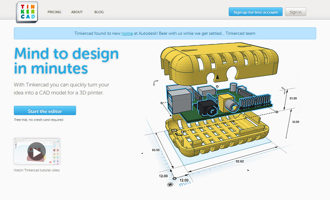
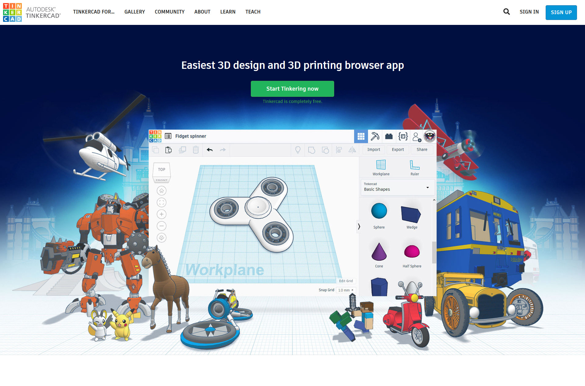
Narrow product positioning.
Tinkercad was positioned primarily around CAD and 3D printing, limiting its appeal to a specialized audience and underselling its potential as an accessible platform for creativity, education, and design.
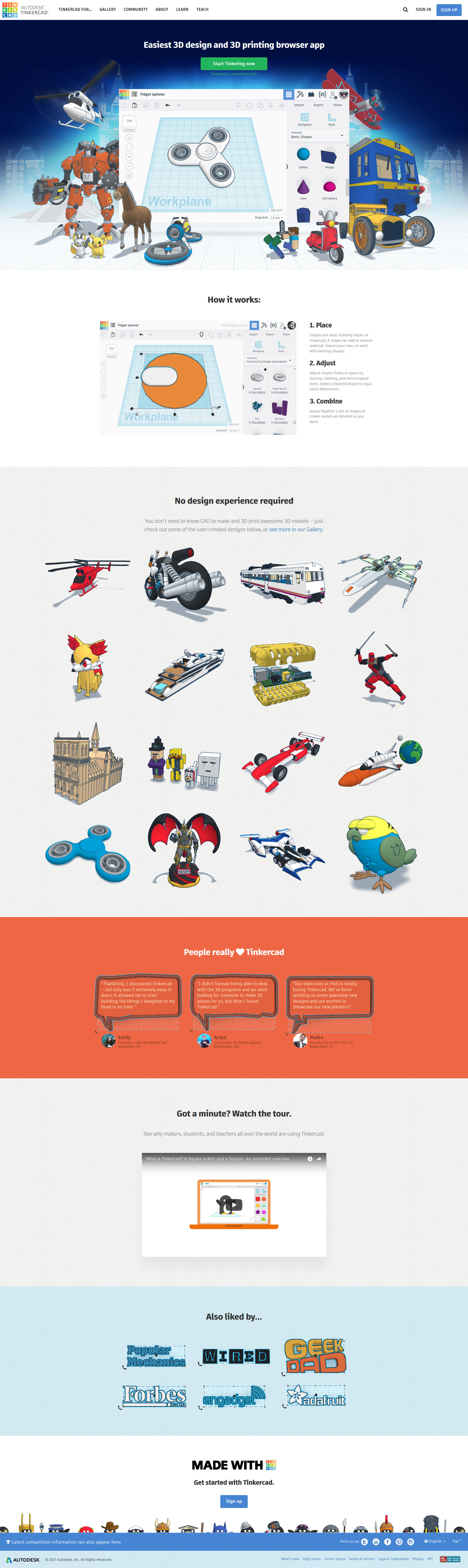
AFTER
Designing for everyone.
The redesign repositioned Tinkercad as an approachable creative platform, helping a broader audience see themselves as designers.
BEFORE
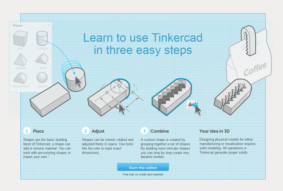
Explaining instead of showing.
Users had to read through instructional content to understand Tinkercad, while abstract graphics often misrepresented the simplicity and immediacy of the actual product.
AFTER
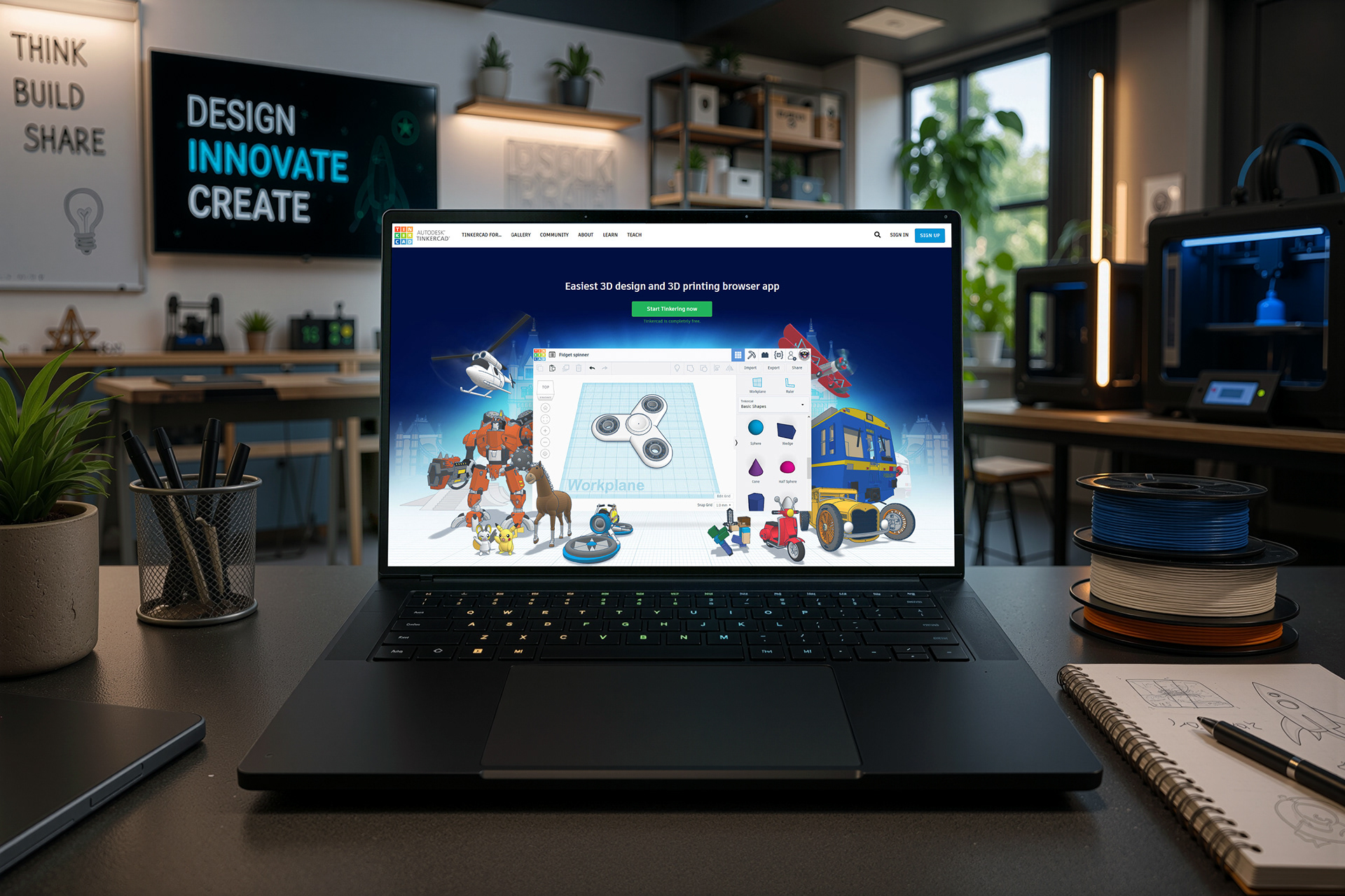
Showing the product in action.
Short, playful animations demonstrated real creation workflows directly, making Tinkercad easier to understand and letting the product explain itself.

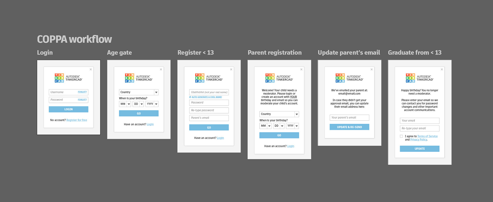
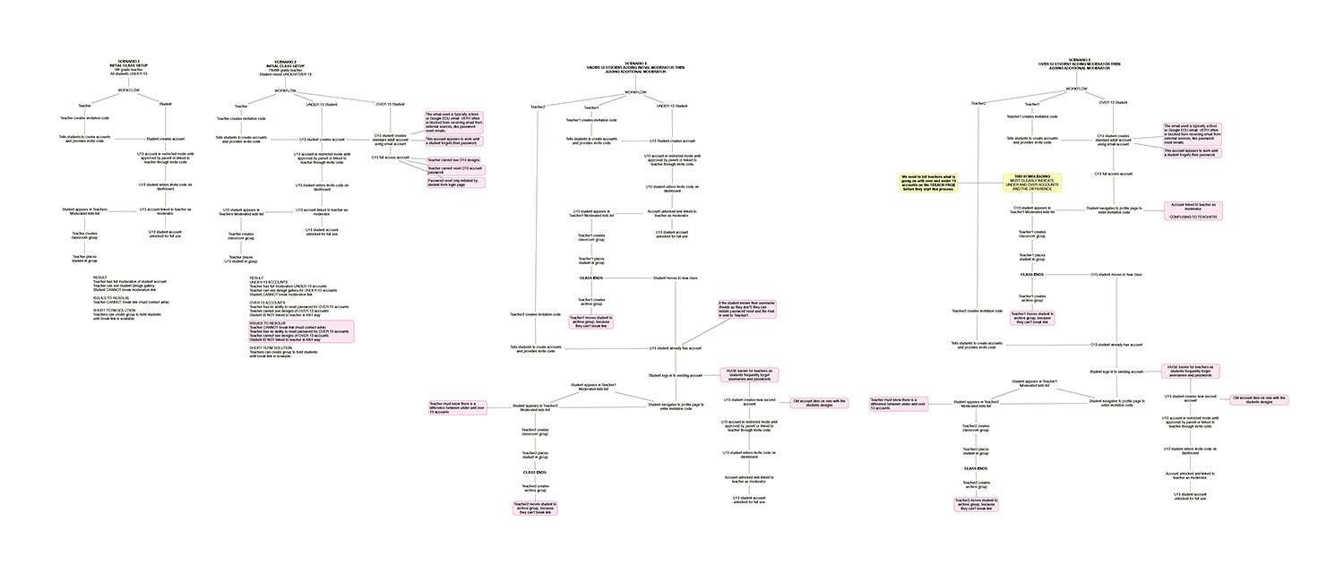
Designing for a global audience.
Instead of limiting research to a narrow segment, I treated Tinkercad’s global user base as the market—designing experiences that could support students, educators, hobbyists, and first-time creators across cultures and skill levels.